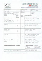
Evaluation Question 1:
Friday, 10 December 2010
Evaluation Question 3:
How did you use media technologies in the construction and research, planning and evaluation stages?
Technology has played a big part in the making of our coursework as it helped us develop our understanding into the horror genre. This is shown throughout my blog and in the final film trailer. We used Mac computers in our media department as a form of computing during the production work. We used Mac computer as they allow us to use programmes and software that wouldn’t be available on other types of computers. Macs provide us with Photoshop were we used it to create out magazine front cover and poster. Photoshop has a wide variety of tools were you can edit work to produce best finished work. Windows PowerPoint was also used a lot as we used it to produce work we then uploaded to Slideshare. We also used it to create our draft of the magazine front cover and poster. This universal software’s were used at different stages from evaluating to analysing out production work.
http://remakadir13.blogspot.com/2010/12/evaluation-of-movie-poster-step-by-step.html
http://remakadir13.blogspot.com/2010/12/evaluation-of-movie-poster-step-by-step.html
For the research and planning stages we got into the habit of blogging consistently on a daily basis for at least 30minutes. We collected our individual research into props and Mise en scene from the internet. This was a huge advantage as we were able to research into the horror genre as well and look more specifically into horrors we wanted to base our concept around. We also used the internet to do a lot of research into synopsis, film posters and trailers. For all of these we evaluated them which helped us clearly see the step by step process in creating our end product, it also gave us an insight into what we could’ve changed and how we could’ve improved it.
http://remakadir13.blogspot.com/search?updated-min=2010-01-01T00%3A00%3A00-08%3A00&updated-max=2011-01-01T00%3A00%3A00-08%3A00&max-results=49
http://remakadir13.blogspot.com/search?updated-min=2010-01-01T00%3A00%3A00-08%3A00&updated-max=2011-01-01T00%3A00%3A00-08%3A00&max-results=49
As we got examples from the internet to help us with our understanding of poster and trailers However, we had to use our own work and original images to create our own poster and magazines. I analysed many different trailers including Paranormal Activity and The devil to help me get an understanding on where to start with the production of our teaser trailer.
http://remakadir13.blogspot.com/2010/10/teaser-trailer-tesaer-trailers-are.html
http://remakadir13.blogspot.com/2010/10/teaser-trailer-tesaer-trailers-are.html
Another important piece of technology we used was a Sony handy camcorder, without this we would not have been able film our trailer. Our Sony camcorder came with a tripod that was used whilst filmiest to keep the shots steady, where appropriate. We also used a digital camera to take still pictures as an evidence of production work. We then transferred the data onto the computer and uploaded them to our blogs.
http://remakadir13.blogspot.com/2010/11/evidence-of-production-work-we-produced.html
http://remakadir13.blogspot.com/2010/11/evidence-of-production-work-we-produced.html
After this we had to edit our shot and put them altogether to make our teaser trailer called 31.10.10. We used Imovie to put the shots together and add any effects and sound we wanted. This made it easier for us to navigate around and add images to any part of the trailer. It was very easy to use and every member of the group got a chance at editing.
http://remakadir13.blogspot.com/2010/12/film-trailer-1.html
http://remakadir13.blogspot.com/2010/12/film-trailer-1.html
As audience feedback we used a Canon camera to film people’s responses to a few questions and uploaded it to our blog. We also used Facebook to get people reactions to what they made of the trailer. This helped us get a better understanding on what we can change and improve on and what our target audience likes to watch.
http://www.facebook.com/home.php?#!/pages/Media-Film-Publicity-Campaign-for-311010/176720165689556
http://www.facebook.com/home.php?#!/pages/Media-Film-Publicity-Campaign-for-311010/176720165689556
Overall, media technologies were used throughout the making of our trailer, poster and front cover of our magazine. Flikr was used to upload all our still images where we could then add a description of each of the photos. YouTube was used to upload any videos that we had in our research and planning. This was very useful when we compared a teaser trailer to a normal length trailer. After using all these media technologies we managed to create a professional looking poster, front cover of a magazine and teaser trailer.
|
Evaluation Question 4:
What have you learned from your audience feedback?
To help asses the effectiveness of our teaser trailer, I gathered some audience feedback to help me improve my evaluation as a publicity campaign. I began by posting the trailer, magazine front cover and poster on Facebook, a social networking site which my target audience is involved with.
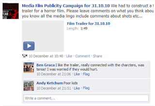
Through this it enables people to leave comments about what they think of the publicity campaign and what is more effective. Although this enables me to get a limited amount of information i also took into account other audience feedback from the previous research and planning.
http://www.facebook.com/update_security_info.php?wizard=1#!/pages/Media-Film-Publicity-Campaign-for-311010/176720165689556
From all the pieces of audience feedback it is clear to me that we have successfully created a three great publicity campaigns. Many said the trailer really connected with the characters and they themselves connected with the children in the trailer and sympathised with them.
Despite the positive audience feedback there is one minor problem. To improve the trailer i will need to get views of anonymous members of the public however, i do not think it is necessary as i am confident our trailer fully serves its purpose as a marketing campaign.
Wednesday, 8 December 2010
We had decided to change the sound in our horror movie trailer. This is because whilst editing, the music didn't fit in properly with the pace of the clips, and the music wasn't creating the eerie, horror atmosphere we were looking for. The music sounded more hip hop style which didn't fit in. So I did more research into horror soundtracks and came across a soundtrack on YouTube. This type of music was fast paced but at the same time did create that scary mysterious atmosphere we were looking for. The music has also fitted in with the pace of our trailer.
Above is the horror music clip we has used, however we are only using 00:59 seconds of it.
This is also a non copyrighted sound track
Film Trailer Edit 1:
This is the first edit of the teaser trailer. It contains the production details, seound and fimled footage in the correct order. The clips have been cut and edited to create continuity and a non realistic horror atmosphere as these shot will not be included in the actual movie. This will be altered and improved in the further development of the trailer after we get audeince feedback.
This is the first edit of the teaser trailer. It contains the production details, seound and fimled footage in the correct order. The clips have been cut and edited to create continuity and a non realistic horror atmosphere as these shot will not be included in the actual movie. This will be altered and improved in the further development of the trailer after we get audeince feedback.
Friday, 3 December 2010
Sound Editing:
Whilst editing we had to include non copyrighted music into our trailer. We found a website http://www.freeplaymusic.com/ to get the sound effects. These were then edited into the background music which was also found on the non copyrighted music site. Sound effects like heavy breathing and dead body thump was harder to find as they didn't sound the way we wanted them to sound. Eventually we found the right sound and Incorporated them into the trailer. We also faded out some of the background music so the dialogue of the trailer could be heard through the music and still have a scary impact. The background music we used was called 'The Relapse'. The background music used violins and and pianoes which goes with conventional horror music. We also added a back beat to give it a more contemoprary twist.
Whilst editing we had to include non copyrighted music into our trailer. We found a website http://www.freeplaymusic.com/ to get the sound effects. These were then edited into the background music which was also found on the non copyrighted music site. Sound effects like heavy breathing and dead body thump was harder to find as they didn't sound the way we wanted them to sound. Eventually we found the right sound and Incorporated them into the trailer. We also faded out some of the background music so the dialogue of the trailer could be heard through the music and still have a scary impact. The background music we used was called 'The Relapse'. The background music used violins and and pianoes which goes with conventional horror music. We also added a back beat to give it a more contemoprary twist.
Wednesday, 24 November 2010
Evidence of Production Work:
We produced a presentation on Flickr in order to show all the work and health and safety which took place on the day of filming. As well as filming we captured moving images as well as still images. For each picture, we have included a brief description - to view the description view the slide in full screen and click on 'show info'. I have inserted the slideshow below:
Click to enlarge and press show info for full description of pictures.
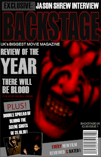
Official Magazine:
This our official magazine poster for 30.10.10 - we decided to use photoshop to produce any posters/magazine covers as it has the best finish results and has all the available tools we need. Below is the an evaluation of how we created the magazine as well as the finished product:
Tuesday, 23 November 2010
Below we have constructed a step by step to how we produced our movie magazine cover.
BACKSTAGE MAGAZINE EVALUATION
View more presentations from Asma77.
Friday, 19 November 2010
Changing of Tile:
We changed the font/style of title as we thought it would go more with out genre. It also fitted into our colour scheme and the picture we used. We still kept the name of the movie but changed the font. We got the font from http://www.dafont.com/ and experimented with the colours and angles.
This is our end result:
Draft Poster:
We made 2 poster to see which one we preferred. We didn't use this poster as our official one as we thought it was too basic and needed something extra. Instead we cropped the picture and placed it one the side of the poster. We got the inspiration to do this from the poster of Case 39.
See blow for official poster.
Wednesday, 10 November 2010
Tuesday, 9 November 2010
Wednesday, 3 November 2010
What we did on the actual day:
We started filming on the 27th October I had planned for everyone to meet at the meeting point I had arranged and we made our way to Naressas house. Once we got there we looked around for good lighting and space since there was a lack of it. We shot 1 scene there and decided we needed a better location where we could finish the rest of the filming. When we as a group decided where we would go next one of the team member Naressa stayed behind. Once we arrived at the second location (Camden Square) we shot 3 other scenes. Since it was getting dark and cold and had children with us we thought we should get back and film again the next day.
The next day I had to pick up the children and wait for a good time in the day to go and film as we needed the right natural light from the sky. This time we filmed at Asmas back garden where we had to go through what was going to happen and who was going to what to the people in the scene. However yet again we were missing a group member Naressa. After filming 2 shots we had to get a little girl ready for to be painted with fake blood on her face and get the equipment ready at the same time. We had adult supervision at all times and assured the children that there was nothing to be scared off as some scenes where really scary. At the end of that we had managed to do 3 scenes there too and in total got 7 shots to put in our trailer.
There were a few things we had to change for instance the mask the killer was going to wear and where the fake blood should go but in all everything was going to plan. We also changed the weapon from a chainsaw to garden clippers as we couldn't get hold of any chainsaws and we thought it would be more safe to use garden clippers.We knew what shots we wanted and what kind of effect we were going for.
Organization of cameras:
Before we could start filming we needed a camera and a tripod to help give us till shots and we could pan some shots. We asked Mr Rosen if we could borrow a camera over the half term and so he gave us one with a clear tape for us to use. We discussed as a group who should be responsible for looking after the camera and we decided that Asma was best suited for that role. In order for us to make sure that the day was going to go smoothly we tested the camera so we were familiar with working it.
My role was to get the actors ready for the shoot. We took turns in filming shots and looked after it by placing it back in its protective case whenever we weren't using it. We made sure that the camera was always fully charged and that it worked so we didn't have any problems during shooting.
After we had finished using the camera we handed it back to Mr Rosen so another group could use.
Tuesday, 2 November 2010
Risk Assessment for filming:
This is the website which helped us to check what we should and should not do at our filming, to prevent any injures: http://www.filmoffice.co.uk/filming.php?pag=hazards
As we used children in the making of our trailer we had to ask permission from the parents and had to be aware of any potential danger as we ourselves are not adults.
We have produced a risk assessment form for both dates we had filmed on. This was approved by both parents and teachers. We had outlined the hazards and control measures needed to make this a safe filming experience. Below is the completed risk assessment form:
Risak Assment 3
We also used a large hedge clipper in which we supervised how it was handeled at all time. We made sure the person holding it was wearing gloves and keeping it at a distance from everyone around him.
This is the website which helped us to check what we should and should not do at our filming, to prevent any injures: http://www.filmoffice.co.uk/filming.php?pag=hazards
As we used children in the making of our trailer we had to ask permission from the parents and had to be aware of any potential danger as we ourselves are not adults.
We have produced a risk assessment form for both dates we had filmed on. This was approved by both parents and teachers. We had outlined the hazards and control measures needed to make this a safe filming experience. Below is the completed risk assessment form:
Risk Assment 1
Risk Assement 2
Risak Assment 3
We also used a large hedge clipper in which we supervised how it was handeled at all time. We made sure the person holding it was wearing gloves and keeping it at a distance from everyone around him.
Wednesday, 27 October 2010
Settings In Horror Movies:
Below I have done some research into the settings used in horror movies and have presented it on a slide form.This research will help influence our film concept, as we have to consider what would be a good setting to use in out horror trailer.
Below is a link to a forum which shows suggestions for a good horror movie setting:
http://www.killermovies.com/forums/
It is a good idea to research into other peoples opinion on horror movie settings because it is important to know what atmosphere frightens people and makes them feel uncomfortable, and from this we can conclude on a suitable setting for our movie setting.
Friday, 22 October 2010
Research into Certification:
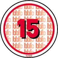
Our movie is rated 15+ and therefor follow strict rules in what we can include. I went on the http://www.bbfc.co.uk/ website and looked at what we can and cannot include in our trailer. I found out that we can:- Show strong threat and menace unless sadistic or sexualised.
- Show dangerous behaviour eg hanging or self harming but should not dwell on detail which could be copied eg easily accessible weapons should not be glamorised.
- Violence may be strong but should not dwell on the infliction of pain and injury
Front cover of magazines analysis:
Film magazines, although aimed at different audiences, they all feature the same conventions, and follow a stock format. All film magazines follow certain house style which they follow in every issue, this house style may include the title of the magazine along as other features of the magazine. Magazines often take stills taken from the actual film to place on the front cover, however pictures taken separate from the film can also be used. A common technique used on the images is to make it look 3D as if it were coming of the page, this done by the image overlapping the title or other pieces of text.
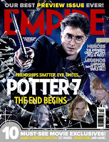
Harry Potter:
An example of this is the empire magazine who used the movie 'Harry Potter'. The image used for Harry Potter is taken from the actual movie with the main characters of the movie. On the front page is the most important character who is the main image and is larger and the supporting characters being at the bottom of the magazine cover with smaller images.The title of the magazine 'EMPIRE' is in the background with the main character just in the front.
Dark Knight:
Another example of this is The Dark Knight but they use a still image not from the movie. Instead they put the antagonist on the front cover of the magazine. This image looks like its in the background of text making it look more scary as if hes coming out the page .
Film magazines, although aimed at different audiences, they all feature the same conventions, and follow a stock format. All film magazines follow certain house style which they follow in every issue, this house style may include the title of the magazine along as other features of the magazine. Magazines often take stills taken from the actual film to place on the front cover, however pictures taken separate from the film can also be used. A common technique used on the images is to make it look 3D as if it were coming of the page, this done by the image overlapping the title or other pieces of text.

Harry Potter:
An example of this is the empire magazine who used the movie 'Harry Potter'. The image used for Harry Potter is taken from the actual movie with the main characters of the movie. On the front page is the most important character who is the main image and is larger and the supporting characters being at the bottom of the magazine cover with smaller images.The title of the magazine 'EMPIRE' is in the background with the main character just in the front.
Dark Knight:
Another example of this is The Dark Knight but they use a still image not from the movie. Instead they put the antagonist on the front cover of the magazine. This image looks like its in the background of text making it look more scary as if hes coming out the page .
Thursday, 21 October 2010
What is more important images or word?
In my opinion i think images are more important as it is the first thing that catches peoples eye when looking at a poster. Images attract people to see a film/movie as it has more clues and narrative as to what the movie is about and if its worth seeing. The title is often simply intended to set up a question in your head; an image can carry more than one meaning or believe through co,ours and movement in an image. However, many people would disagree and say that words are just as important as people respond to it better than images. Images can take a while to be processed in your head whereas words can be simulated quickly. Words have just as many meaning than images as how a word is written and shaped has to be taken in to account.
In my opinion i think images are more important as it is the first thing that catches peoples eye when looking at a poster. Images attract people to see a film/movie as it has more clues and narrative as to what the movie is about and if its worth seeing. The title is often simply intended to set up a question in your head; an image can carry more than one meaning or believe through co,ours and movement in an image. However, many people would disagree and say that words are just as important as people respond to it better than images. Images can take a while to be processed in your head whereas words can be simulated quickly. Words have just as many meaning than images as how a word is written and shaped has to be taken in to account.
Target Audience Profile:
- Lady's and Gents aged between 15+
- Like the thrill of horror movies and like to be surprised
- Have allowances of £10 a week in addition to school and work fees
- Are interested in the latest movies and trailers
- Have a very outgoing social life
- Come from households with incomes of £35,000+
Ben aged 16 and Carol 17 are a couple. They both live in the city with their family in 4 bedroom flats. In their free time they like to hang out and watch movies together. Both are college students who study film studies hence their interest in having movie nights. Ben and Carol both have a wide collection of DVDs which they share between them. Ben's mum is a upcoming actress, for now she works as stock characters in horror/thriller TV dramas. Carol's mum is a reporter for the online version of the empire magazine.
Props:
What is the significance of props in horror movies?
Without props, horror characters would not be scary. For example, try to imagine Jason Vorhees without his machete, Freddy without his claws, Michael Myers without his mask and even Jigsaw without his puppet tricycle thing. Many great horror films have a lot in memorable moments and the use of their props help to add value to their characters. It is a known fact that every killer in a horror film has a good prop beside them. However, even the normal protagonist who don't kill anyone, for example ghost or vampires, have their props. An actor in a horror film can only do so much to scare the audience without their props. I f Jason Vorhees stood over them looking very plain like and shouting wouldn't give anyone a fright. We linked the props to our ideas as we plan to use a chainsaw and distinctive clothing to separate the antagonist from the protagonist.
Costumes:
The concept of our film trailer was to focus on the idea of keeping the antagonist anonymous. To do this, we had chosen to keep the face of our antagonist hidden. I have researched other films and found that many horror movies use masks or a lot of makeup to cover the disfigurement or face of the killer. This has influenced our groups idea on how our antagonist should look like. Friday the 13th
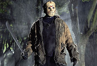 On the left is shown the antagonist in the film 'Friday the 13th'. He is shown wearing a mask to keep his identity a secret from the audience and of those who are in the movie. This is a good example of what we want our antagonist wearing as the mask looks scary and the holes adds depth to the mask as you can see they eyes but keeps the rest of the face hidden even with all those holes. This is the kind of look we want to achieve in our trailer.
 The Texas Chainsaw Massacre
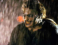 On the right hand side you can see the antagonist from the movie 'The Texas Chainsaw Massacre'. Here the villain isn't wearing a mask but a lot of make up to form a distorted face and this also makes the villain look scary and not something you would come across everyday and it is not seen as normal in society.
Wednesday, 20 October 2010
Shooting Schedule:
Today, we have also decided the dates we are going to start shooting our trailer. We have carried out a substantial amount of research and planning which had helped us gain our understanding of the horror genre and trailers.
 The date we will starts shooting our trailer is on 27th October 2010. We have all decided on our location too. The trailer we will be shot at one our group members house and garden. We have decided on this location because our synopsis is all about a man, who steals kids on Halloween and makes them play horrific games with them inside the house. The garden will be used were he buries the children.
We are going to film after 6pm when it starts to get dark to give the trailer the full horror effect and keeps the audience more alert, feeling like they need to keep their eyes closed and peak through their fingers.
Today, we have also decided the dates we are going to start shooting our trailer. We have carried out a substantial amount of research and planning which had helped us gain our understanding of the horror genre and trailers.
 The date we will starts shooting our trailer is on 27th October 2010. We have all decided on our location too. The trailer we will be shot at one our group members house and garden. We have decided on this location because our synopsis is all about a man, who steals kids on Halloween and makes them play horrific games with them inside the house. The garden will be used were he buries the children.
We are going to film after 6pm when it starts to get dark to give the trailer the full horror effect and keeps the audience more alert, feeling like they need to keep their eyes closed and peak through their fingers.
Initial Title and Changes:
Today we had a group discussion and even though we have based all our research around our initial title 31, we have changed our idea after doing some extra research. We have decided that that we are going to change our title to '31.10.10'. All the planning and research we have carried out and blogged will still apply to our new title.
We have decided to change the name of our title simply because we though having just 31 isn't enough to excite the audience, although it represents the date halloween, we though we could take it a step further and represent the actual date of halloween this year. There will also never be October 2010 again, so the 10 10 really has a lot of significance to the present day. It also signifies that the film is going to be very modern and will always be remembered for it's date.
Our title was influenced by other film's whose titles consisted of numbers, for example, Friday the 13th and Case 39. These numbers also had a huge significance in the film and really informed their audiences on what the film was about.
Tuesday, 19 October 2010
Synopsis:
In a small town called Camden the man behind door number 31 isn't who the neighbours think he is. To them hes just a vulnerable man who's never had anyone but himself. On the night of trick and treats one man changes everything in the spine-tingling horror, written and directed by an extraordinary collaboration of Naresa Azemi, Rema Kadir and Asma Begum, who have all been previous award winning horror directors and writers.
The man (Jason Shrew) kills the children one by one after he puts them through a roller coaster of hell with his horrifying Halloween games that he plans all year. When a string of grisly murderes puts the town on high alert, the man dissaperas to his family farm in the countryside and leaves the parents wondering what happened on the night of celebration?
Jason Shrew had a troubled life growing up, his parents abused him, they were both alcoholics. He tried to find an escape. He attempted every possible thing in the book to be seen as a popular kid by his classmates but regardless he remained the outcast. One day everything changed. He realized that if he turned to crime and deviance he would finally get some attention. The journey to hell for many people started on that day.
The gifted cast of '31.10.10' take the audience into the mind of a very troubled man, longing for some attention and love, but he goes about things the wrong way and takes kids and families through some gruesome and chilling encounters. How many murders will it take for the parents to figure out who the killer is? Will someone survive? Embrace yourselves for this award-nominated horror movie and strap yourselves in because you are in for the fright of your life.
Tuesday, 12 October 2010
Mise En Scene:
Mise en Scene: These are all the things that are put into the scene e.g. the setting and decor. Narrative films often manipulate the elements of mise en scene to intensify or undermine the ostensible significance of a particular scene. Lighting: Light effects the way colours are rendered, both in terms of hue and depth, and focus attention on particular elements of the composition. Most mainstream films rely on the three point lighting style, and its genre variations. Summary/Plotline and Narratives: There are three typical horror elements found in many horror movies: A fierce creature is the first typical element found in horror movies. A lot of movies in this genre use fierce animal to make a plot, making that animal huge, savage and intelligent can without a doubt horrify people. Using characters who are frightened all the time and are running away from the creature also excites people. These characters always succeed in escaping from some danger, but sometimes fail to escape from other dangers. The supernatural is the second thing which is used as a typical horror element in this movie category. Supernatural things are often used to scare people and have a unique style and have become very popular. The third horror element is murder. Filmmakers often use a scary human character to be a typical element. In some movies, the character wears scary clothes and a mask as he commits the murders. These movies nearly always start with a group of friend or people and each one gets killed until there is a revelation of the murderer in the end of the movie. During this time the audience anticipated who is the murderer and most of the time incorrect. These are also conflicts at the end of the movies, which surprise people as most conflict are related to revenge. This helps our concept as it gives us an idea of what to base our concept around and how to go about doing that. |
Our Concept:
In our group, we came up with our concept which will be everything from mise en scene to props, plot and story line and all the other conventions we will include in our trailer.
We have decided to call our film 31 as it really grasp onto the horror idea as 31 is a significant date in October as it is Halloween. It is also the the number 13 if you flip it around which isn't the luckiest number/day only on a Friday. Our story-line is about a man who no one sees all ear round, until the 31st October, which can be no other day than Halloween. He snatches any children who trick or treat at his door and puts then through a roller coaster of hell with his horrifying Halloween games he plans all year round. He then viciously kills them but who will survive? Will he get away with this cold blooded, sick mind games? Why does he do this? All will be revealed if you patently wait. Embrace yourself for an inviting trailer which will make you want to come and watch 31 at cinemas near you!
Tuesday, 5 October 2010
Monday, 4 October 2010
Teaser Trailer:
I compared a teaser trailer with a normal full lenght trailer:
I compared a teaser trailer with a normal full lenght trailer:
Tesaer trailers are usually only made for big budget and popular themed movies. Their purpose is to tell the audience about the movie content than simply to let them know that the movie is coming up in the near future and add to the hype of the upcoming release. Teaser trailers are often made while the film is still in production or being edited and as a result may feature scenes or alternative versions of scenes that are not included in the finished film. Teaser trailers today are increasingly focused on internet downloading and the convention circuit. Most teaser trailers dont even introduce the super heros or any action.
Wednesday, 29 September 2010
Applying Recognisable Conventions Of Trailers
In groups of three we came up with ideas about the recognisable conventions of a trailer and we had to promote our trailer called Bloodshed High.
As a group we decided what to base our movie around,Vampires/Dracula in an American high school.
We started to sketch our ideas onto a 12 shot story board explaining how we are going to go about our trailer.
The USP of our film trailer is that it was going to be released in 3D as this enhances the illusion of depth perception. Another USP was to have a mixture of genres, teen movies/horror, which is explained in more detail in our production movie blog below.
We included a famous actor, Robert Pattison, because he is well known to star in other horror movies such as 'Twilight' and has been a big seller. This actor is also known to many teenagers therefore bringing more audience to us. ENJOY!
Tuesday, 21 September 2010
Conventions of Trailers
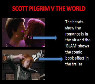 From these screen grabs you can see that the movie has a blend of both comedy and romance genre's. The video game animation gives the trailer a unique convention as this is not often seen in many movies. The animation may also suggest that the movie is suitable for a younger audience.
The trailers includes the movies release date towards the end of it. When this is shown you also get additiona; information such as th eir website, credits to Universal Studies and the record name of who made the soundtrack to the movie.This is a good way to also get the publics intrests in other forms of the media which stills connects then to the film.
My Dog Tulip Trailer
I looked at this trailer to comapre with the trailer 'Scott Pilgrim V The World'. This trailer has much longer shots and gives more of an understanding of what is happening. There is a voice over throughout the trailer explaining the narrative of the story which develops the charatcer in the trailer. The genre differs from the first above trailer as this trailer is mainly cartoon based. Towards the end the trailer the credits are shown in more detail and how they are involved in the movie.
WHY DO PEOPLE GO AND SEE MOVIES?
We summed this question up with some simple answers such as the genre of a movie, maybe because of the story line (narrative), unique selling point for instance a 3D movie, actors in the movie or simply because of film reviews. As a class we focused on three different movies to see how each trailer captures the audience’s attention. Below I have evaluated two of the three movies and shown the conventions each trailer uses.
 From these screen grabs you can see that the movie has a blend of both comedy and romance genre's. The video game animation gives the trailer a unique convention as this is not often seen in many movies. The animation may also suggest that the movie is suitable for a younger audience.
Giving the directors name in the trailer could also be another reason why people would want to go and see it as if a previous movies was directed by this person and the movie turned out good then viewers would want tosee more films produced by him/her. The directors are trying to sell the movie as their name is being credited. In this case we see two popular movie names ‘Hot Fuzz’ and ‘Shaun of the Dead’ which are both also comedy movies.
When watching the trailer we realize that quick rapid shots are used and this makes the pace of the trailer more faster which keeps the viewer more interested and focused on whats going on. They also capture the best pats of the movie making the trailer a kind of summary. The non-diagetic music adds onto the pace as it is also quick and up beat. Along with the music and rapid quick shots, there is dialoug which gives us a clue to the narrative so audience know what the film is baseed around.
My Dog Tulip Trailer
I looked at this trailer to comapre with the trailer 'Scott Pilgrim V The World'. This trailer has much longer shots and gives more of an understanding of what is happening. There is a voice over throughout the trailer explaining the narrative of the story which develops the charatcer in the trailer. The genre differs from the first above trailer as this trailer is mainly cartoon based. Towards the end the trailer the credits are shown in more detail and how they are involved in the movie.
Wednesday, 15 September 2010
Research and Planning:
Before starting the task set i had to research what is already out there and what makes a good trailer. I also had to look at the movie posters and see what went into it and what makes a good one. To the images below i connoted and denoted each poster to give me an idea of what i had to produce. In all the posters i looked at the title first to see what clues it gives me about the film then base them on the ideas i associate them on.
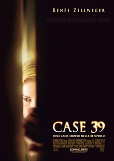 In this poster the name of the title seemed like a mystery or law movie. The number 39 seemed to be important and significant in the movie. By looking at how the title was written gave me a clue as to what genre the movie may belong too. The glowed, black background with classical old style font suggested it may be a horror/thriller movie.
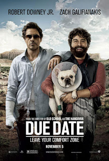
This movie title was thought to be about pregnancy or something time bounded. However, after looking at the poster we found it to be either comedy based or comedy horror. The way its written in block capitals and in white shows that its pure and simple comedy.
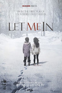 This title was thought to be about someone or something to be locked out trying to come in. Immediately we thought it would be a horror movie as it has a title that would suit it. Our judgement was correct as looking at the poster and how the title is written looked spooky. The skinny reddish letters give the movie a sense of no hope and bloody and gory.
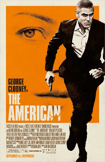
This movie title was harder to guess what the genre was. At first we thought it might be a comedy about culture clashes then we thought it might be about the American dream or patriotism. We then looked at the poster and found out that the movie genre is an action film. The yellow background and silhouette figure gives it a more modern feel which is emphasizes with the bold font in white.
Before starting the task set i had to research what is already out there and what makes a good trailer. I also had to look at the movie posters and see what went into it and what makes a good one. To the images below i connoted and denoted each poster to give me an idea of what i had to produce. In all the posters i looked at the title first to see what clues it gives me about the film then base them on the ideas i associate them on.
 In this poster the name of the title seemed like a mystery or law movie. The number 39 seemed to be important and significant in the movie. By looking at how the title was written gave me a clue as to what genre the movie may belong too. The glowed, black background with classical old style font suggested it may be a horror/thriller movie.
This movie title was thought to be about pregnancy or something time bounded. However, after looking at the poster we found it to be either comedy based or comedy horror. The way its written in block capitals and in white shows that its pure and simple comedy.
 This title was thought to be about someone or something to be locked out trying to come in. Immediately we thought it would be a horror movie as it has a title that would suit it. Our judgement was correct as looking at the poster and how the title is written looked spooky. The skinny reddish letters give the movie a sense of no hope and bloody and gory.
This movie title was harder to guess what the genre was. At first we thought it might be a comedy about culture clashes then we thought it might be about the American dream or patriotism. We then looked at the poster and found out that the movie genre is an action film. The yellow background and silhouette figure gives it a more modern feel which is emphasizes with the bold font in white.
Analysing a Trailer:
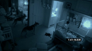
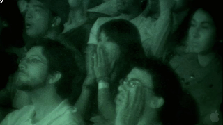
I watched the trailer of Paranormal Activity 2 on Itunes and started evaluating it through 5 set questions.
We are told the name of the movie at the end of the trailer as it keeps the audience gripped to find out what the name of the movie is.

we are not told who is starring in the movie as it is a sequel and the same actors/stars are used again.
We don't see any major action as the whole movie is done by hand held camera to give it a sense of realism. The major action of t
he trailer is of a man being thrown against the camera in the trailer, a dog braking and a child standing.
There are no music in the trailer as its is the sound of the natural environment. The trailer includes as scene where the audience is watching the trailer and they end up screaming.

The speed of the trailer stays the same as if you were watching the movie. The speed of it is very slow as they want to grip the audience into what is going to happen next. This also adds more drama to the horror movie even though not a lot is going on.
The information that was given in the very last frame of the trailer was the movie name and who directed it. In some cases it can also show the release date for people to go and see it.
You would expect to see this trailer in the breaks of TV programmes and before film in the cinema. This is so it intrigues the viewer and you wouldn't forget it as it has a lasting image in your mind.
Subscribe to:
Comments (Atom)


