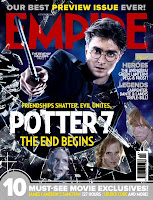
Film magazines, although aimed at different audiences, they all feature the same conventions, and follow a stock format. All film magazines follow certain house style which they follow in every issue, this house style may include the title of the magazine along as other features of the magazine. Magazines often take stills taken from the actual film to place on the front cover, however pictures taken separate from the film can also be used. A common technique used on the images is to make it look 3D as if it were coming of the page, this done by the image overlapping the title or other pieces of text.

Harry Potter:
An example of this is the empire magazine who used the movie 'Harry Potter'. The image used for Harry Potter is taken from the actual movie with the main characters of the movie. On the front page is the most important character who is the main image and is larger and the supporting characters being at the bottom of the magazine cover with smaller images.The title of the magazine 'EMPIRE' is in the background with the main character just in the front.
Dark Knight:
Another example of this is The Dark Knight but they use a still image not from the movie. Instead they put the antagonist on the front cover of the magazine. This image looks like its in the background of text making it look more scary as if hes coming out the page .


No comments:
Post a Comment